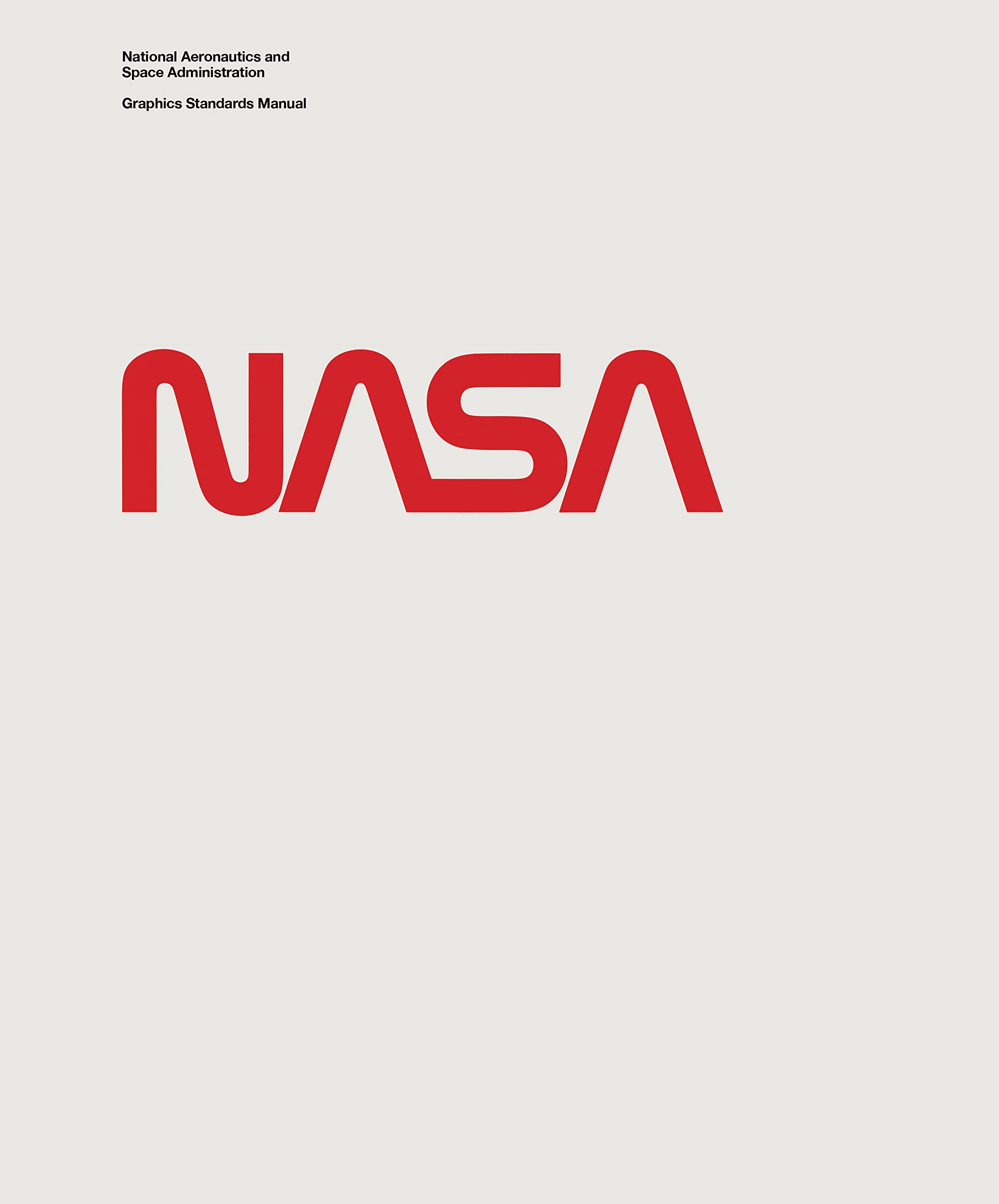

Jesse ReedNational Aeronautics and Space Administration Graphics Standards Manual
A**M
A treat to look at
A great book if you're interested in the old Nasa logo design and the like
D**.
Space Nerds Rejoice!!
This is a beautiful collectors item for the space nerd or design enthusiast alike. The packaging itself is very high quality, kind of over the top with how big the box is and how much packaging protection was in there, I assume to mimic the presentation of a parcel being loaded on a rocket and shot into space? Whatever the reasoning it lends to a very nice unboxing effect. The book it’s self is a very high quality soft touch hardcover with beautiful glossy scans of the original NASA Graphics Standard Manual from 1975. Even though the NASA Graphics Standard Manual has since become a free PDF on the NASA website (you’re welcome if you didn’t know), the hard copy is still really nice to have on your shelf or coffee table. Space Nerds Rejoice!!
R**N
NASA corporate style guide
In Christopher Bonanos front-of-book essay about this design manual, he clearly points out the hazards that designers face in creating a new corporate look for an organization. Maybe the most difficult is when some of the top management doesn't agree with the aims of the corporate image of the two designers who created the NASA look. The brilliant logo was referred to as the 'worm' (and management wanted to know why the cross bars were missing from the two As?) but it's a thousand times better than the two previous service marks designed by James Modarelli (he wasn't a designer).Bruce Blackburn and Richard Danne, with a small design shop, created this very comprehensive design manual for NASA that was introduced in January 1976. It covers the use of the logo, stationary, forms, publications, signage and vehicles. Some pages that interested me, as a publication designer, were the examples of publications using a grid. The visual templates are quite comprehensive allowing anyone at NASA to create interesting-looking printed matter for internal use.The vehicles pages include foldouts for a variety of vans, cars, buses, aircraft and spacecraft. There is also a foldout, in the Supplementary Guides, showing NASA clothing. Over the years after its introduction in 1976, the NASA corporate look slowly evaporated so that today the corporate look is no look. The back of the book has twenty-two pages showing the NASA Manager's Guide from 1983. A sort of design manual lite.The format of this book is to reproduce the original manual pages, which were printed on one side only, slightly smaller than the book's pages and with a faint creamy color. The manual was spiral bound with nine brown pages with tabs.I thought the book was a fascinating creative document from the 1970s with visual ideas that still look fresh today. You can look inside the book at Westread Book Reviews then click 2024 and July.
A**P
Excellent
Product as stated and delivered on time.
T**E
Five Stars
This is one for every graphic designer's book collection
M**A
Five Stars
love it
P**3
A Classic.
Ordered one off the Kickstarter. Its a very very nice book. The nostalgia is real and the manual is worth the money.
J**E
Bel ouvrage
Offert à ma fille pour son anniversaire, superbe ouvrage, très qualitatif, même la pochette aluminium et l'emballage carton contribuent à cette expérience. Elle était ravie.
N**O
Beautiful
Beautifully made and a worthy addition to any designers collection.
V**S
Otimo acabamento!
Livro excelente! Otimo acabamento e vem numa embalagem muito legal!
A**L
Excellent Book For Brand Identity Designers
Very good book for brand identity designers and graphic designers, Content is intermediate but visuals speaks it self.
G**
Quasi perfetto
Libro davvero ben fatto, pagine di qualità anche se devo dire di aver trovare 2 pagine staccate, per la qualità e il prezzo del libro è stato davvero un dispiacere.Per il resto è un bellissimo testo anche da esposizione.
Trustpilot
1 month ago
2 months ago